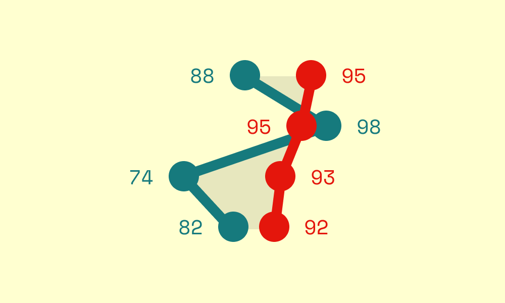
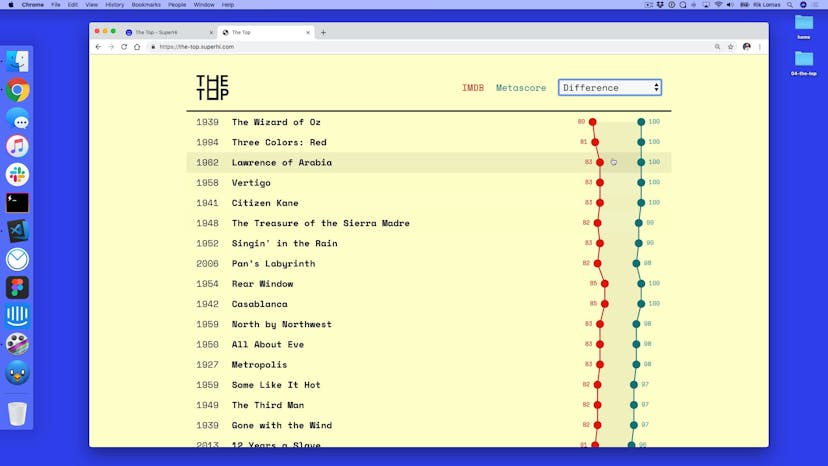
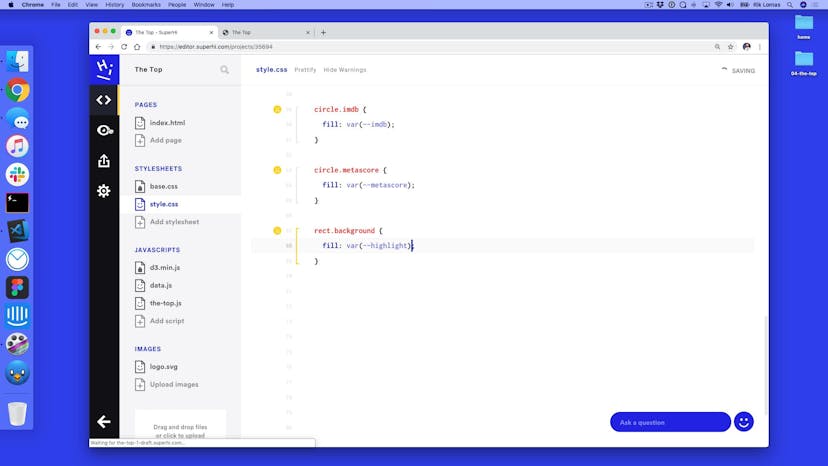
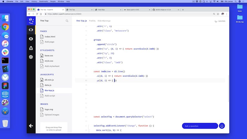
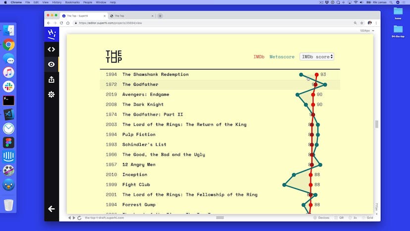
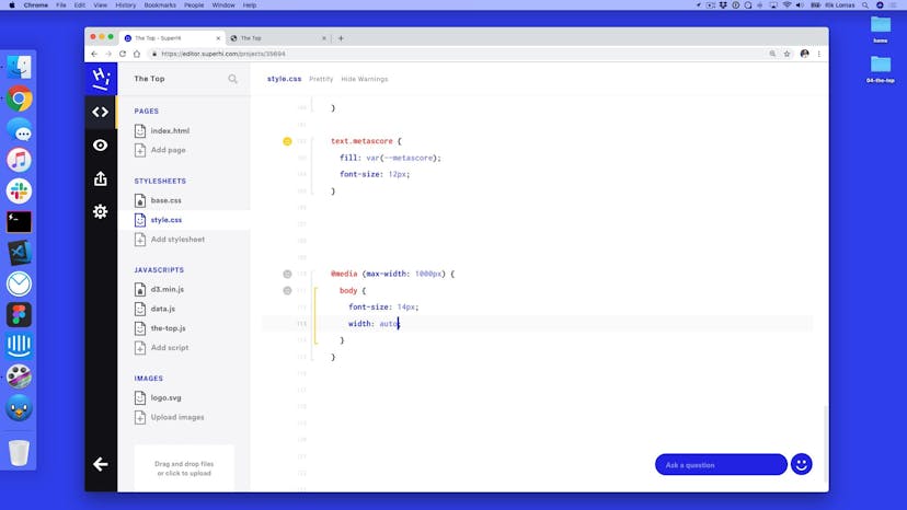
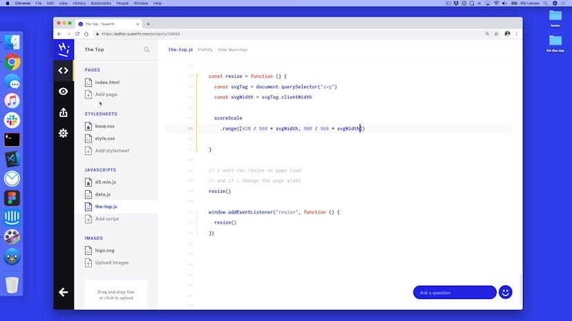
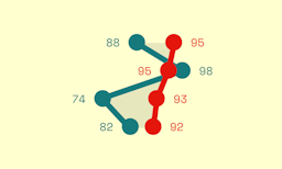
In the second part of The Top, we add in line and area shapes to make our visualization clearer, and add in labels for our scores. We also discuss responsive design and media queries to make our designs suitable for any device.
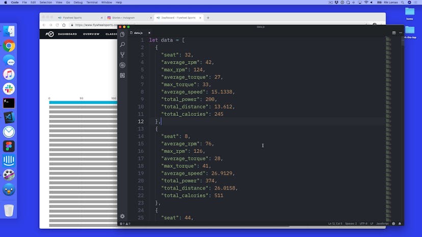
This homework is more of an open design challenge. Use the data in the dataset to visualize a set of results from a indoor cycling class.
You're welcome to design this visualization in any way you'd like. If you're stuck for ideas, try a simple bar graph! Here are some suggested options to try...
Turning the data set into a bar graph
Adding in hover states and transitions
Adding text elements per bar based on the seat number
Adding a select tag to re-order based on different data
Add in axes for your design
Send over any projects to hi@superhi.com, we'd love to see what you create!

