Adding CSS Grid to our tagline
Transcript
00:00
- [Instructor ] So now that we've done the header and the footer, we're actually gonna work on the main content of the page and this will fill up a lot quicker than it will actually seem, I promise. So most of this content is kind of sections to the page. We have a section of tagline. We have a section for the first project, project two, project three, project four, and even on the other pages as well, section of about, and section of contacts as well.
00:21
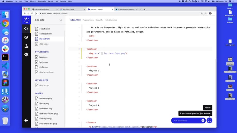
So this is the main way that we're gonna be working. Now there isn't a kind of tag in html in our list called tagline or project, but there is other things that we can use in here. So if this is the content section as part of MDMs html element list and what we can see in here is sections and because I've been talking so much about sections we're gonna add this to our site. So we're gonna use a section tag next. So in our code, what we're gonna do is go back to our index.html and instead of this artist in Portland Oregon, between our header and footer, we're gonna start filling in all of the sections.
00:55
So the first one is we're gonna add a section and close this and again, we're gonna open this up and this, inside here, for now, is just gonna be where the tagline will go. So I'm just gonna write tagline. The next section underneath here, and this is outside of this current section, so between the tagline and the footer, is gonna be another section called Project 1, and I'm gonna do this a few times.
01:19
Gonna do Project 2 and outside of this Project number three. Oh that's four, three, and another section down here called Project 4. Now eventually what we'll do is we'll add sections to the other pages. For now we'll just focus on one page. I like to focus just on one page at a time and then add extra thins later on. So at the moment what we'll see on the site is something like this, tagline, project, project one, project two, project three, project four.
01:49
So what we're gonna do first of all is add some space between everything so we can see down the page. So I'm gonna go into my style.css and I'm gonna do this maybe after all of this, but before footer. So I'm just gonna, again trying to keep the order a little bit sane for me, I'm gonna do section. So the first thing I wanna do is add some space between them all. So I'm gonna add a margin between everything.
02:14
So let's see what this is. So a margin between them. I think that's wrong. I think it's 80. Yeah, it's 80. So I'm gonna add a margin between everything of 80 on the top, zero on the left, on the right, 80 on the bottom, zero on the left. So what we should see now is a bit more of a gap going down the page and again I can just change my footer back to what it should be, 'cause I just got this wrong.
02:39
So I'm gonna change this back to space between. There we go, beautiful stuff. So I'm gonna change this back to space in the center. So just center there instead. There we go, beautiful stuff. So now what we have as we go down the page is this kind of idea of a tagline. So what I wanna do in each individual section is apply a set grid to all of this. So to do this, still within my section, I'm gonna use a different display type.
03:12
The display type I'm gonna use here is called grid. So one is called flex, one is called grid. So grid all of our stuff does align to a grid. So this is what we want to do to set things up. So here what I want to set up is the same thing as what I set up in our layout grid. I had in here a gutter of 32 and a 12 column grid and the width of this. Now the width doesn't really matter because we know the total width of the page already. We just need to know there's 12 columns and a gap between all of them.
03:41
Now we don't really see this as part of our css right now, but we'll do is we'll start to work into this as we go. So, because I wanna set up a 12 column grid I'm gonna do a grid-template-columns and this is gonna have a repeat and in brackets we want to repeat 12 times, 1fr. So a little bit more complex. So we're using repeat and round brackets. We're gonna repeat 12 times, one fraction. So this is a 12 column grid and each column is exactly the same.
04:19
We're also gonna add in here a gap and the gap is gonna be what. Well remember from before what we said is originally it was 24 and Andre had a suggestion going up to 32. So we're gonna make this one 32. So 32 and 32. So we're doing it in two directions, because there might be gaps going down the page as well as across if you're going to the next section. So what we're gonna see now is something that looks like this.
04:46
Exactly the same as before. So we need to start filling thins in to the page now. So the first one we're gonna work on is tagline. So how do we do this? So in my index.html, instead of it just saying tagline, what I'm gonna do is replace this tagline with a h1 style. Now I can add multiple h1s on the page as long as they're the same hierarchy, but what goes inside h1? So remember from before we had some copy and I can take this either form my assets, or I can take it from thigma.
05:16
I'm gonna take it from thigma. I'm gonna copy this in from here in here. So let's see how this looks. Now at the moment what it will do is it will go down the page because it's trying to squeeze all of this into one grid. Now I want this to go across the middle of this page. I want this to be not only in the middle, but also on this kind of second column. So it's second column and going across 10. So how do I do that? Well what I'm gonna go and do is add another style.
05:48
So just like we had with our footer where we said footer and then a tags, I wanna pick the h1s inside section. So I'm gonna pick the section, then the h1. So here what we're gonna say underneath this is were gonna add a new style. The style we're gonna add is section for h1 and we're gonna add some curly brackets. Here what we wanna say is we want this h1 to go across 10 sections, 10 columns, and also start a number two. So to do this what we're gonna say is grid-column.
06:25
It's gonna be starting in number two. So let's see how this looks. There we go. It's shifted over, but we also want this to span across 10. So the next thing we're gonna do is a / span 10. So this is gonna start at two and span 10 across. So it looks a little bit like that. Now the other thing that we want to do with this h1 is basically align it in the center. Now how do we do that? Again, there's another style that we can add in here, called text align.
06:57
So underneath here I'm just gonna add text align center. Now center with and -er. If you are British or Canadian, it ends with and -er rather than -re. So one thing to do is kind of see this in action. There it is. Now what we can also do is just quickly add a background color to this to see if it looks correct. I'm gonna add a background color of red. Now this is a common tool I use quite a lot.
07:20
Again, it's just for seeing these things in action and there we can see this is our 12 column grid. There's one column here, one column here. We can change this really, really quickly. So we can add a lot to this. Maybe we don't want it to be that, maybe it's eight instead. If we add it as eight than there's a bit more gap over here. We wanna shift it over by one more grid and make it three instead. So we start at three, one, two, three across and span eight. There it is in the middle.
07:48
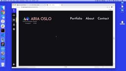
So we can play around with this and make it basically whatever we like. Again, I'm gonna keep it like my designs two, and 10. Background color isn't there, it's see through. Straight to the black color and there we have, we've got the first tagline section up and ready to go.
SuperHi FM
Want some ambient music in the background? Play our radio station!

