Styling our footer with CSS flexbox
Transcript
00:00
- [Instructor] So where else on this project am I using this idea of flexible layout? So if I just quickly go through my project, let's have a quick look. So, I've got it on my header because these things don't align. This thing does align 'cause it goes across 10 columns, again this thing does align 'cause it's going to across eight and four, eight and four, eight and four, eight and four.
00:20
And it's really the footer that again, is the same kind of idea. This one aligns in this direction, so we want this to have a footer that goes across the page, and then these two items that go into the middle. So, this is what we're gonna do next. We're gonna add a footer to the page, and then work the way into the content. So, we're gonna make a general area called, footer. Now, there is again, just like header, a footer tag. So in my index.html, I need to add some content for the footer with two links inside of it, and then style it up.
00:50
So, this is a common practice of doing things and features in HTML CSS. We add the content and style it up. We add a bit more content and style it up. And then add a bit more content and style it up as well. So, what we're gonna do, at the bottom of my page in index.html, set a new tag called, footer. And I'm gonna open this up. There we go! Just to add some space, just to make it a little bit easier to read.
01:16
And again, I'm gonna press Tab just to make it, again indentable, so it makes it a bit clearer what's going on, and what goes inside my footer. So, let's have a look. There is Instagram and email. So, first thing we're gonna do is we're gonna do an a tag. An a tag because it links somewhere else. The text that people can see in here is, Instagram. There we go! And outside of this, still within our footer though, we want another link for email.
01:47
Now, just like we had from before, we have index, about and contact.html, this doesn't have a separate Instagram page and it doesn't have a separate email page, instead, what we want to do is link it to other places on the internet. So again, this isn't called link 'cause this could go to an email, for instance. This is a for anchor. What we wanna do on each one is add a space after the a with href, hypertext reference.
02:14
Again, nice and 80s of us their equals in quotes. Again, there's no space here, href equals quotes, no spaces. And we wanna do the same thing for email, href equals in quotes. There we go! When we want to link to something like Instagram, we might wanna link to a certain page on Instagram, like our profile page. So, for instance, I wanted to link to the superhi website as superhi website or the superhi Instagram page. So for instance, if I wanted to link to this superhi Instagram page here, let's say that Aria doesn't have one ready or we don't know what it is.
02:47
We're just gonna put https://www.instagram.com. and then our username choose this hisuperhi. So this will now link to Instagram when we go through to this page, what about email? Well, if I just wanna open up an email this first bit here, this https is what's called a scheme, basically is a scheme that's used in web browsers. But we don't wanna use a web browser here we wanna send an email. So what I can do here is also add in mail to column. So mail to will tell the browser to make a new email.
03:28
Who do you want this to go to? We want this to go to aria.oslo.artist@gmail.com. Now again, this is a fake email address I've made it out myself so don't email this, but this is actually a real email address. But when I click this, this will actually open up in my inbox. So this will look like Instagram and email but these are using two external links, one going to Instagram's website and one will actually pop up something completely different.
03:57
Another thing that we can actually do, is actually replace this with a telephone link. So for instance, we could do tell, and then someone's number five, five, five, one, two, three, four, five, six, seven, that will actually do it on a phone and load up the call screen for instance. Now for this one, obviously, is email so we're gonna have it as an email address but let's see how this looks. If I go back to the page right now, Instagram and email, I need to style this up a little bit nicer.
04:23
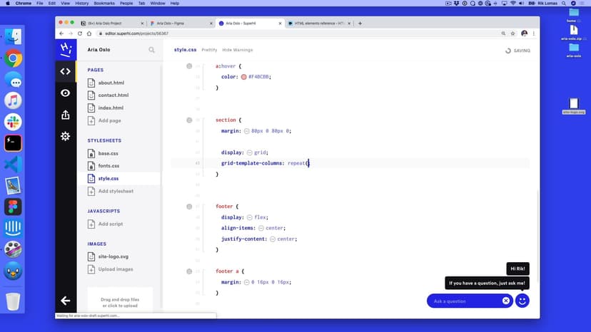
So again, how do I style this up? This isn't the footer, and one of its footer looks a little bit bigger, I wanna style it up in a nice way. So again, back in style.CSS, I also wanna apply this styling, not just to my h1 and my nav, but also comma, my footer. So this is a bit larger, it's got the right style in there, Instagram and email. Now the issue that I've got is this isn't in the center of the page, it's just the default way it would set.
04:51
So I wanna add this flexible layout in here for my footer. So I'm gonna put the footer at the bottom. So I'm just getting some space but footer curly brackets. What do I wanna do with this footer? Well, I wanna lay it out in this flexible way, display flex. What do I want it to be in a direction? Well, I want it to be in the default row direction. We see it right now, again, it doesn't make any change, 'cause these are text links anyway, what I wanna do is move them into the middle of the page.
05:21
So how do I do that? I'm gonna align all the items in the center, and then also justify the content in the center. So it's centered and centered in two different directions. There we go, it's kind of in the middle. Now, when I say it's kind of in the middle, it's not directly because this margin on these things is kind of offset to one side. It's only having margin left and not right. So this is kind of shifted over a little bit. It's actually 16 pixels over to the right, because it's 32 over this way.
05:54
So how do I overwrite this, just these links? So what I'm gonna do is I wanna basically get rid of this and do just a facade links to be slightly different. So underneath here, what do I wanna select? Well, I wanna select the footers links. But how do I do that? Well, if I look at my index.html, I know my a tags inside footer, and with CSS, we can do something quite similar. We wanna pick the footer first of all, then add a space, and then what we usually do, is do something to it using curly brackets, but we're not for now.
06:32
We're gonna do a space and then inside the footer, we're gonna pick all of the a tags and then do something to those. So notice if I hover here, it says there's five html tags on index, though html is five, eight tags there. And on the footer one, there's only two. So this is actually a more specific here. What do you want to do here? Well, we wanna basically have this margin both on the left but also on the right as well. So here, we can add some margin, zero, 32, zero, 32.
07:08
So let's see how that looks. This is overwriting this just for these footer links. So, now what we should see is this isn't the right position, but this is adding double gap, which kind of makes sense because it's 32 and 32. So we can actually half that to be a 32 gap between them by adding these are 16. So, 16 on the left 16 on the right, so 16 here, 16 here. So this is now 32 between them. So this is in the right position now is right in the middle of the page, again, it can kind of align this to this middle point is that look right, that looks pretty good to me.
07:47
Obviously, the footer is right at the top of the page, but we gonna add some content in, but these are how we do flexible layouts. We can change this really really quickly. And this is a really powerful tool for instance, I can click on some of these and say flex and what happens here, this should go over here to that side, which makes sense. But I can add things like space between, which is this one and that will kind of add the links on both sides, one and two.
08:13
So there's a lot of things I can actually do with this layout. So notice it doesn't align to a grid. This is actually a flexible layout, which is kind of what we want. So these are the kind of things to think about when we're actually looking at these figma files. Does it align to a grid? Yes or no, if it does align to a grid, we'll talk about grid a little bit later. If it doesn't, we can use flex
SuperHi FM
Want some ambient music in the background? Play our radio station!

