Creating an about page
Transcript
00:00
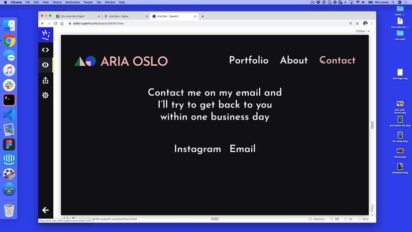
- [Instructor] So, we finished our home page, and we're gonna use pretty much the same techniques on our about page and a very quick version of the contact page. So what do we need to do on our about page, first of all? Well, if we look at the about page, it just says about page. What we can do is actually take our header from our index.html. I'm gonna copy it and paste it here. Same thing with footer, I'm gonna go to the bottom here and get our footer.
00:27
Copy and paste. There we go. So again if I look at my about page now, I've got the same thing as what I have normally. I can add a section tag in here, just like we have on the other pages, and because this is a section tag and it still uses the grid, I wanna just kind of lay this out in the same kind of way. So notice that CSS works across the site, it isn't per page, and if I wanna change things per element, or area, I suppose, we would do that in CSS in the same way.
00:57
So for instance, doesn't really matter that this is on this page or this page, it's gonna look the same. So what we're gonna do next is, we're gonna basically replicate what we had here. So we had the section here, with the class of project, and we had two different div tags in here, that had a layout on them, and then within that, they had two different things, an image and some text. So we're gonna do the same thing here.
01:17
If you wanna try and skip ahead and see if you can do this, have a go. I'll do this right now and you can kind of catch up. So here, what we're gonna do is a section with the class of, what should we call it, about maybe? Yeah, let's call it about. And in here, what we want is two areas, two kind of groups. So the first group is gonna be a div tag, and this has a class of, well, let's do photo, this is gonna be the photo area.
01:44
And separately but still with inside the section, we're going to have another div class. So notice that inside, and this one is gonna be class description. And in the photo, what we're gonna do is, well, we're gonna add the image. The image is the headshot.png, so this is an img tag. Again, there's no closing one on this because it's a single tag and there can't be any more content inside of it. And in here, we're gonna have a source of headshot.png.
02:13
And also, good for accessibility, good for SEO, search engines, we're gonna add an alt, and this is gonna be Aria Oslo headshot. So at the moment, when we start adding some content, I'm just gonna write in about me for now, just to see how this looks. Let's see how it looks on the site. So again, it's pretty small on this page, and the reason for that is that everything's in the same place. So what we wanna do is actually for this about section, have it in two different areas.
02:42
So that's the next thing. So description and the about section and a photo in the about section are gonna look a little bit different. So, in my style.css, let me go back here, I'm gonna add some space, and my section with the class of about, is gonna have, what? Well, it's gonna have two things inside of it, div with the class of photo. And this one is gonna be a grid-column, it's gonna start at one, but this one is gonna span not four, but six.
03:14
And the same thing for description. So this section, with class of about, is gonna have a div inside of it called description. And this one is gonna do, div at grid-column, is gonna start at seven and span six. So just by adding this in, notice how quick it is to kind of fill this out, it's been really, really quick. Once we set up the general styles of the page, it gets really quick to start to add pages. So all we need to do is add some style and text in here.
03:46
So what do you wanna add as text? Well, again I'm just gonna quickly go back to Figma, gonna add my text from up here. This is an h1 rather than h2. So I'm gonna make sure that's the right one. So in my about section, I'm gonna add not about me, but h1, and that's here, so that style. Again, I'm just gonna move this in, just to make it a little bit easier to read. Now you might notice here as well, we have two different bits of text.
04:13
We have one and two. So this is actually two paragraphs, and I'm gonna take the first paragraph, copy this, and still within my description, underneath, I'm gonna add a p tag. P for paragraph. And paste that there. And underneath this paragraph, still within my div, notice this yellow box goes around, I'm gonna add a p tag here. The paragraph number two.
04:36
Copy this and paste that in. Nice. So what we should see on the page now, is something that looks like this. Now the reason that this is kind of off-center is because it has some text alignment and some margin on this, and we can overwrite this by default. So how do we overwrite this h1's defaults? Well, we have some style farther up the page, and we can overwrite this by being more specific.
04:59
So here in the section.about, is a h1, and this has no margin at all. Zero, zero, zero, zero. So let's see how that looks. Again, why is it like this? Well, if you look farther up the page, you might notice how we had a section with h1, here it is. And this has some text alignment in the center. So we want this to be on the left this time. So here, we're also gonna add text alignment, and this is gonna be on the left.
05:27
We're gonna reset this and overwrite it. So now what we should see is this lines up. We might wanna add some space in our paragraphs, so maybe some space here and space here. That's where the paragraph two starts. Let's add that in as well. So for this, we've got in our section.about, we got p tags in here. This is gonna have some margin. 16 on the top, zero on the right, 16 on the bottom, zero on the left.
05:54
Going clockwise, or trouble, T-R-B-L. So there we go, it's pretty quick to add in, so one thing to kind of realize is how quickly this can be added in, in very quick ways. So once we've had the general setup of the page, it's very quick to add this in a modular way and overwrite the things we want to overwrite.
SuperHi FM
Want some ambient music in the background? Play our radio station!

