Molding our layout
Transcript
00:00
- So, project number one looks totally fine but there's still some issues. There's two main issues that we have to think about. One, this is kind of altering different sides. So, we have one on this side and one on this side as well. How do we go about doing that? But also with this kind of alignment as well. So, this isn't the full height, as this is right now at the moment they're pretty tall, how do we shorten them down? So, this kind of more vertical one, how do we squeeze it down a little bit more? So, first thing we're going to do is actually squeeze these images down.
00:29
Now the quick way to do this is at a maximum height onto all of these images. So, if for instance, I do this project image and just say a max Heights, I can add something like 600, I think it's 640 is the final one that I was going to use. So, let's see how that looks. Now this actually makes it a certain height, but how do we make it in the middle of this area? Well, the issue is at the moment we can't, and the reason for that is because this won't align to the grid.
00:57
We can actually see this in action. This isn't in the middle of the grid. So, the way that we'd actually do it is we'd fake it. What we do is we put this inside of the group, which does span this eight instead, and then move this image into the middle. So, how do we get this group done? Well, again, I'm going to use a div tag to group this up and move it into the middle. But I'm going to do this on all of the images so they don't work any differently.
01:22
We have a lot of control. So, what I'm going to do around each image for all of these, is add a div tag. So, I'm going to add a div tag here and move this image into here. There we go. And the same thing here. So, now I've done it for all four, but if we'd go and check what's going on, you'll notice this looks wrong. All of these, divs aligned on the ninth column, which kind of makes sense if you read our CSS.
01:56
Hey, what we're saying is every single div is in the same place. So, how do we choose between each of these div tags? So, the way we do this, is we add a class. So similar to what we did about section.project, what we going to do is add a label between each one. So for instance, I want this one to be the art and this one below it to be the description. So this one is going to get a class of artwork and this one is going to get a class of description.
02:39
So, notice I'm giving it a label now, so my project has an artwork description. So, I'm going to go down and say this div has a class of artwork as well. And this one has a class of description, and the same thing, and the same thing. Now, because we just put these labels on it, it's not actually going to do anything in our CSS. It's still going to look broken. But the issue that we can do now and fix is basically give a label to certain things.
03:20
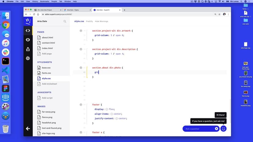
So for instance, I want my artwork to be on this far side and the description to be on the right. So, what I can do now is just quickly go back into my code and say, not just every div tag, I just want the div with the class or the label of description to be this. And the same thing for this one up here. I want to change this to not be the image now, but be the group instead.
03:45
So, div.artwork. So, when we say div.artwork we mean that div tag with the class of artwork. A space between these things means go inside of the first thing. So, look inside this third thing for a div with a class of artwork. So, what we should see now is you should see, well we still have some problems. We still have this image, this image is going fine.
04:10
It's actually getting cut off now. So, we still want to add some style to the image itself. So, we want to move this out. Now, what we have now is what we had at the start, we just kind of group things up a little bit differently. This is still too long, but what we can do now is say, well, underneath this a section.project has an image and this image is going to have a maximum height of 640 pixels.
04:37
So, here we say in the layouts here we've given some instructions to each individual tag within the layout. So, now what we'd get isn't that looks like this. And what we can do is move these images into the middle of this group. Now, we want to target the group here. The group is the artwork, so I'm going to do text dash align center and this will move it into the middle. So, we'll have this in the middle, this in the middle, and this in the middle as well.
05:04
So, now what we have is something more close to what our layout is. The only other thing that we want to do is switch these layouts occasionally. So, this one wants to change and then this one wants to change. So, in the same way I can add another class to the ones I want to change the layout to. How do we do this? What we're going to do in our index.HTML is which projects want to switch layout.
05:29
So, I'm starting at the top again. I want this one to be fine, the first one. But the second one, I do want project, but I'm going to space here and say project-alt. So, project tag and the project-alt tag of classes on this. And then the third one, project totally fine. And then the last one, I'm going to add project-alt. So, what I want to do on the project-alt tags is switch the layout completely.
05:59
So, what we're going to do is then use this project-alt in the same way as before. So, what I'm going to do is basically take this, I'm going to copy this and put it below. There we go. So, we've got the original stuff up here and I'm going to overwrite it. Dash alt, dash alt. So picking the only, the alternative ones only and I'm going to switch these layouts.
06:24
I can remove this, don't need that anymore. So, I'm going to take this one. So this one, this div.artwork is going to start at five and this one is going to start at one. So, this one is going to start one and then five over here. So, what we should see now is just by adding an extra class of this, we should get our layout looking pretty good. Apart from this one thing, what is going on here. By default grids will always go into the next line.
06:52
There is a way to fix this using a grid auto layout. So, what we're going to do is just quickly go back (murmurs) what we set up, all of our grids and we just going to add one more thing to the general section. The general thing we're going to say is grid auto dash flow dense. Now, by default this was just going to go into the next line. But what this will do, if there's space, we'll squeeze it into the space and for these, there is space here and we can fit them into that space.
07:22
So, now we've made this layout really, really quickly. It might have taken a bit of time to get working with this, but once we start to kind of mold and work with HTML and CSS, it actually gets pretty quick to do the stuff that we want to do.
SuperHi FM
Want some ambient music in the background? Play our radio station!

